A cooking companion designed to make finding recipes & learning to cook feel effortless
My role for this project was the lead designer and lead researcher. Though I had many responsibilities, my main impact was setting the visual direction & design system, owning the high-fidelity recipe and search flows, and steering research from interviews through usability testing.
Cooking apps treat finding a recipe and actually learning to cook as the same problem. They aren’t. Most home cooks juggle a Google search, a YouTube technique video, and whatever happens to be in their fridge — three apps, three contexts, no continuity. People who want to get better at cooking end up with more tabs open, not more skill.
Our research surfaced two related-but-distinct jobs the product had to do: help people find recipes that actually match what they have and feel like eating, and walk them through cooking those recipes in a way that teaches as it goes. Sage was scoped around those two jobs from the start.
Sage is built around two core solutions: an image-to-recipe scanner that turns whatever’s on the counter into recipe options, paired with a Big Index of ingredients and techniques that teaches inline; and a chunked, step-by-step cook-along that walks users through each recipe one move at a time.
The recipe and step-by-step flows were the riskiest pieces of the product, so we built them first. If users couldn’t evaluate a recipe at a glance or follow it without losing their place in the kitchen, nothing else in Sage would matter. Prototyping these flows ahead of the indexes and onboarding let us put real interactions in front of cooks early, pressure-test the mental model, and decide what to keep, cut, or rework before committing to the rest of the experience.
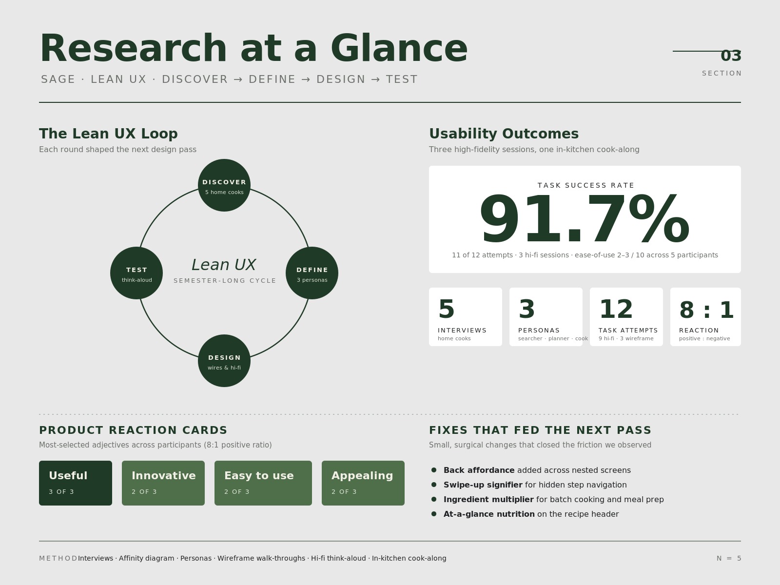
The research followed a Lean UX approach across the semester, where design decisions were continuously shaped by user feedback. Early on, the team ran interviews with five home cooks, mapped the findings into an affinity diagram, and translated the patterns into three personas — a goal-oriented searcher, a planner, and a creative experimenter. Those personas drove the first wireframes and shaped what got built versus cut.
As the prototype matured, we ran moderated, think-aloud usability tests on the high-fidelity flows, including one in-kitchen cook-along session. Tasks succeeded 11 out of 12 times, ease-of-use scored 2–3 across the board, and Product Reaction Cards skewed heavily positive (Useful, Innovative, Easy to use, Appealing). Testing also surfaced sharp, fixable issues — a missing back affordance, an undiscoverable swipe-up gesture, and the desire for at-a-glance nutrition and an ingredient multiplier — which fed directly into the next design pass. Each round built on the last, creating a continuous cycle of testing, learning, and tightening the product around real cook behavior.
This project showed me how much a clear design system and a tightly scoped vision carry a multi-person product. A shared aesthetic — Bauhaus-leaning minimalism, Helvetica Neue and Baskerville Libre, cool earth tones color-picked from an actual sage plant — kept recipe, step-by-step, search, and the indexes feeling like one app even as flows split across the team. Cutting the marketplace mid-project also taught me that protecting the core experience matters more than shipping every idea on the original sticky note.
What could be better: